Typesetting with Illustrator and AI2ASS Part I: The Basics
Due to popular demand I decided to start a small series of articles on using Adobe Illustrator and AI2ASS for typesetting, starting with this introductory post.
What is AI2ASS and why do I need it?
AI2ASS opens up the world of vector graphics to softsubbing by exporting vector drawings from Adobe Illustrator to ASS drawing commands. This greatly expands the possibilities of what you can do within the limitations of the ASS subtitle format, while simultaneously providing a user interface suitable for doing complex typesetting. Many of you have probably used AssDraw in the past, which technically also is a (crude) vector drawing program but offers only the most basic features exposed through a terrible GUI, making it essentially useless for any tasks that go beyond creating simple shapes. Within the past 2-3 years, both subtitle renderers and authoring tools have seen significant improvements, making complex typesetting that perfectly blends in with the background practical in many cases. At the same time, video quality of fansub releases is at an all-time high and you sure don’t want to ruin it with crude typesetting. It’s worth mentioning that AI2ASS is not the only tool of its kind. If you prefer a different workflow, competing solutions are available for Corel Draw and Inkscape, however I don’t have any experience with them.
1. Prerequisites
Software
This first part of the guide requires you to have installed:
Note that AI2ASS actually does work with AI versions as low as CS5 but this guide will make use of new features introduced in CC 17.1, so if you are stuck with an older version, you’re on your own.
Knowledge
This tutorial is aimed at typesetters, so you are expected to have firm grasp on typesetting with Aegisub. You don’t have to be an AI pro, however if you have never used a vector graphics program before, I recommend that you take a few minutes to familiarize yourself with AI prior to reading this guide (or maybe watch an introductory video).
2. The Basics
It’s important to get some basic understanding of the possibilities, constraints and limitations of the whole progress, so here goes:
Basic Workflow
After you start AI for the first time, you want to customize the user interface to make the tools and facilities most important for typesetting tasks more visible. The specifics are ultimately down to your personal preference and you’ll figure out what you need as you go along, but there’s one thing you always want to be prominently visible: The Layers Panel. 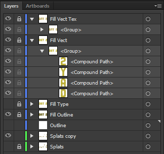 Layers in AI will become separate lines in the final ASS output, so it’s vital to always organize your layers properly or your ASS output will be confusing to work with in Aegisub (at best). The layers panel not only shows all layers, but basically the whole scenegraph - that means Sublayers, Groups, Compound Paths, Type and so on. Left to the layer or element names are the Lock and Hide checkboxes.
- Hidden elements will be hidden from view and not exported to ASS.
- Locked elements cannot be selected and won’t be affected by any tools, which is useful in case you don’t want to accidentally modify an element that is already in its designated shape and place.
New elements start out unnamed and will only show their type name instead. As the sign you’re working on becomes more complex, the amount of layers increases and it becomes increasingly important to name them in order to not lose track of things. To do so, double click the label and type a descriptive name. Another Panel you always want to keep visible is the Pathfinders palette, because you are going to use them a lot. Just for reference, this is my AI workspace:  Now that we have our environment set up, it’s time to typeset something. For simplicity’s sake we’ll start out with an ordinary mask. To be able to do so, we’re going to need the video to be the background of our canvas. But since AI doesn’t support video, we’ll have to make do with a single frame.
- In AI, create a new document. Make sure the resolution matches your script/video resolution and Color Mode is set to RGB.
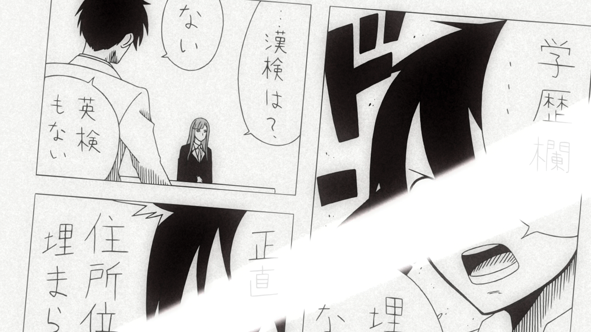
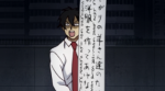
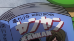
- In Aegisub copy a video frame to the clipboard and paste it into the AI document. For our first example, take this frame:

- Move frame into place so its borders perfectly match those of your canvas
- Lock the layer containing the background image
- Use the
 button at the bottom of the layers panel to create a new layer. With this, you’re ready to go.
Essential Illustrator Tools
I originally didn’t plan on doing an AI tutorial because there’s plenty of those on the internet, but since I know you guys are lazy, I’m giving you a brief rundown of the most important tools for typesetting-related tasks.
 Selection Tool [Hotkey: V]: Selects objects such as whole paths, groups or compound paths. Moving your mouse pointer to the outside of an object, right next to an anchor points, turns the selection tool into the rotation tool.
 Direct Selection Tool [A]: Selects single anchors of one or more paths. Use this to drag anchor points or to delete a bunch of them (using the selection marquee)
- Live Corners: Selected vectors will show the Live Corners widget, which easily lets you round corners or otherwise customize them. Dragging the widget will always affect all selected corners, so use the Direct Selection Tool if you only want to modify one or a few corners.
- Default Behavior: grows or shrinks the rounded corner radius
- Double Click (Direct Selection mode): pops up the Corners dialog that lets you adjust the corner shape
 Pen [P]: Creates and modifies paths.
- Default Behavior: Creates the first anchor of a new paths. Subsequent anchors will be added to the path.
- Click and Drag: adds a smooth anchor point, turning the path segment into a bezier curve. You can adjust its two handles while holding down the left mouse button.
- Click on an existing path: inserts an anchor point.
- Click on an existing anchor point: removes the anchor point and closes the path.
- [Alt] + Drag path: turns the pen into the Reshape segment tool. This tool is new in AI 17.1 and constitutes a huge usability improvement. You’ll love it.
- [Alt] + Click anchor point: Converts a corner to a smooth anchor point (results in a bezier curve).
 Pencil [N]: enables freehand drawing of vectors. Until the latest update it wasn’t all that useful when using a mouse, now double clicking the tool allows you to adjust the fidelity of the pencil.
- Default Behavior: Lets you draw a new path.
- Draw on top of a selected path: allows you to easily reshape parts of the path.
 Type Tool [T]: in most cases you’ll be using Aegisub to place text, however AI is much more versatile and offers tools for tasks that would be a real chore to accomplish with Aegisub:
- Vertical Type tools
- Type on a Path tools
- The Touch Type tool, which lets you manually adjust position, size and kerning of every character.
- If you want to make use the OpenType features of a font, such as contextual/random/stylistic alternates or even just ligatures, you’re pretty much stuck with AI, since VSFilter doesn’t support any of them.

 Eyedropper Tool [I]: Like in Photoshop, this picks the color under the cursor. However, it does so by getting all properties of an object. Say, if you have a blue rectangle with a red stroke, the Eyedropper picks the fill and stroke colors. A raster image (such as your background frame) does not have a stroke, so picking a color from there will disable the stroke. The following modifiers can be used:
- [Ctrl]: temporally selects a target for pasting picked properties. Once the object is selected, clicking another Object with the Eyedropper will copy fill, stroke properties, character style and other properties to the selected object.
- [Alt]: pastes currently picked properties onto the object under the cursor.
- [Shift]: makes the eyedropper set the currently active color to the fill color of the object under the cursor. Useful for picking a stroke color from a raster image.
 Scissors Tool [C]: Splits an object along a segment or at an anchor point.
 Knife Tool: Splits an object along a freehand path
- Some tools mostly work like they do in Photoshop and don’t require further explanation: Rectangle/Ellipse/Star Tool, Paintbrush, Eraser, Magic Wand, Lasso.


There is also a bunch of shortcuts worth remembering as they can speed up your work a lot:
- Ctrl+L: New Layer
- Ctrl+J: Join open (selected) paths
- Ctrl: Switches to the last used selection tool while holding down the key
- X: Toggle between fill and stroke
- Shift+X: Swap fill and stroke
- Tab: Show/Hide all panels (in case you did it by accident and wonder where all your tools have gone)
Example 1: Getting Down and Dirty with masks
Now that you know about the essential tools, practice using them to mask all the speech bubbles on our sample. Mask the whole bubbles (not just the text) and be reasonably precise as we don’t want them to contain random spots of grain. I’ll spare you the walkthrough and just give you a few hints:
- This is a job for the Pen Tool.
- Use [Alt+Scroll Wheel] to zoom in for maximum accuracy.
- Use no fill and a thin, high contrast stroke while drawing the paths. That way your shapes won’t obstruct your view on the background.
- Make separate layers for the bubbles and the light beam
- If you want to blur the masks later (which you most certainly want), extend every path going along the corner of the canvas just a little (or more depending on the desired blur strength) beyond the canvas borders to prevent the background from shimmering through in the final result. Do the same for adjacent beam and bubble masks.
Your result should look like this (click for .ai file):[](//files.line0.eu/ai2ass_guide/part1_basics/ai2asstut1_recemploy_masked.ai)… and is now ready to be exported to ASS vectors. So fire Aegisub and open AI2ASS from the _File > Scripts menu in Illustrator. 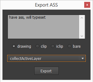 The exporting procedure is fairly straightforward. The export dialog can export vectors as complete drawings,
 \(i)clips or bare drawing commands and offers 4 modes of operation:
- Collect Active Layer: only exports the contents of the currently active layer (highlighted in the Layers Panel). This will create at least one ASS line and as many as number of colors used by the contents of the layer (1 line per color). Sublayers are currently not supported.
- Collect All Layers: like [1] but exports the contents of all layers, creating at least as many lines as there are layers with content. Does not create lines for empty layers. You usually want to use this mode.
- Give Me a Seizure: like [2] but exports empty lines for empty layers. Doing this is necessary if you’re creating clips for a set number of (fbf) lines and don’t want empty clips to mess up the line count and line order.
- Collect Inner Shadow: refer to the AI2ASS docs for instructions on how to use this mode
For our mask example set the mode to collectAllLayers and export the vectors as drawings. AI2ASS will run the conversion and output the results in the edit box at the top of the window - ready to be copied to the clipboard. Paste the result into the Aegisub subtitle grid (NOT into the subtitle edit box!), set the start time and check the result. You should notice 2 things:
- All lines have the
{\an7\pos(0,0)\p1}override block by default. AI2ASS nowadays always create floating point vectors, so a scale of 1 should be obvious. As for the positioning, all vectors get exported exactly how they’re positioned on the canvas and since the top left of the canvas is (0,0), the script will automatically insert\an7and\pos(0,0)to correctly position the line on your screen. This may result in your actual sign being quite far away from its\pos, which is not a problem as long as your signs is already in its final position in AI and never moves from there. However, if you plan on moving, rotating or animating the sign, this kind of positioning is often undesirable and painful to work with. You can easily solve this problem by moving the sign next to the top left edge of your canvas prior to exporting it with AI2ASS. Your sign may even be partially or fully outside the canvas, but moving it too far away may run you into ASS renderer bugs later.Since our sample mask is a perfectly placed static mask and pretty much extends over the whole video surface anyway, we are A-OK with the placement as it is. - The layer order is reversed! Or well, actually there is no layer order. All layer numbers are set to 0 and AI2ASS exports layers exactly in the order they appear on the layers panel - that is from top to bottom and exactly the wrong way to make it work in ASS without layer numbers. However, I think it’s actually good thing as it always reminds us to number our layers. Once you have done that, the mask should show up correctly.
OK, so far so good, but we could’ve also just created the mask in Aegisub by using the vector clip tools (albeit in a less convenient manner), so what can you do in AI that you can’t achieve with just Aegisub?
3. Useful AI Tools and Applications for Typesetters
Here’s a non-exhaustive list of tools I used to achieve certain effects in signs I had to do so far:
- The Pathfinders: Shape modes and pathfinders are easily the most important feature found in AI when it comes to working with multiple shapes. They let you unite, intersect, substract, divide, exclude, trim and crop paths and are the foundation of many basic and “advanced” techniques.
- The Stroke Tool: It’s pretty much the
\bordof Illustrator, but much more powerful. While\bordis always rounded and aligned to the outside of text and vectors, AI lets you freely*limitations apply, see Example 2 align the stroke to the center, inside or outside of paths and offers rounded as well as angular corners and caps. There are a couple of Width Profiles to choose from, e.g. for giving your type a bulgy appearance and you can even use one of the many pre-defined brushes (shipped with AI or found on the internet) as a stroke. A popular application for the stroke tool is creating sharp borders for angular fonts.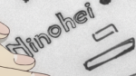

- Simplify Paths: This tool doesn’t make your typesetting look any better (it might even make it look worse!) but it helps a lot to decrease the number of anchors and paths of your signs, which in turn increases rendering performance. And since many AI operations steeply increase the complexity of your typesetting, always simplify paths prior to exporting your signs to ASS unless you know the anchor count is already optimal.
- Warp Distort: This is your go-to tool when you need arced text and can be applied simpler and faster than the Circular Text macro in Aegisub, while giving a nicer looking result.
 It also supports a number of other warp styles (like bulging and inflation) that may come in handy some time.
 - Mesh Distort: The Mesh Distort tool lets you freely distort type and shapes along a grid of a user-defined number of rows and columns. I’m sure there are many applications for this tool but I found most useful for typesetting on uneven surfaces and handling complex perspective found on clothing and books.

- Free Distort: Despite its name, this distortion tool actually gives you less freedom than Mesh Distort, but it’s also much easier to handle because it only offers you 4 points of control (corner pin). It can be understood as a more flexible superset of
\faxand\fay. - Gradient Tool: The beauty of gradients in AI is threefold:
- You can freely pick a gradient direction, rather than being constrained to strictly vertical and horizontal gradients
- It comes with a nice WYSIWYG user interface giving you a lot of flexibility when it comes to picking colors as well as setting the positions of color stops and midpoints. This lets you match complex gradients and lighting in a sane manner, whereas trying to do the task in Aegisub using a gradient script would take 9001 hours of trial and error (mostly error).
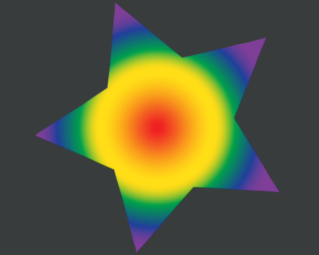
- You can do radial gradients. I haven’t had the chance to use one in an actual sign so far, so have a gay star (rendered in Aegisub) for now.

 Preparing gradients for export to ASS is a bit tricky, so I’ll make a separate blog post about it.
- Roughen Filter: It’s a simple tool that often comes in handy when we have an almost-matching font that’s just a bit too clean or flat for our sign at hand or in case we want a shape to look more “organic”, like a drawn line or a piece of parchment.
- Offset Path: does exactly what it says on the tin. Depending on whether your offset is positive or negative, it will either expand your path outwards (similar to what a stroke does) or inwards. It’s especially useful for “thinning” shapes. Thinning a shape can also be accomplished by using stroke and multiple pathfinders, but this way is much faster.
- Extrude and Bevel: This one is more complex in comparison to the other tools mentioned so far, but if used properly you can get awesome 3D effects out of it, complete with lightning.
- Image Trace: Many of you will be drawn to the trace tool because on the first look it provides an easy way to turn existing raster art into awesome vector graphics. In practice, the results are often less than stellar for any of these reasons:
- The image requires preprocessing (e.g. in Photoshop) to be tracable. This is often the case for images with dynamic lighting (dark and bright spots) or big differences in local contrast between areas you’re interested in.
- The image simply doesn’t lend itself to tracing. Only geometric and discernable shapes can be turned into meaningful vectors and photorealistic, soft or noisy images don’t tend to be very geometric.
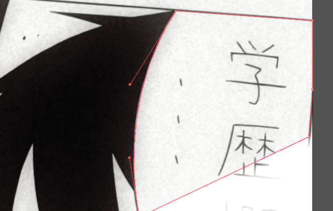
- The source resolution is too low. I experienced this firsthand while trying to trace this image. No matter how hard I tried preprocessing this image, in the end my results were either aliased or a featureless blurry mess.
- The settings used didn’t match the content. You pretty much always need to tweak the settings for every new image to get a decent result.I’m most likely not going write a blog post on tracing as a part of this series, because quite honestly I don’t know much about the subject and you can probably find much better advice on a community dedicated to tracing images. Just a final word of advice: Don’t try to manually fix totally broken traces. It’s a giant time sink, so suck it up and just manually trace (read: redraw) it.
- Patterns: Instead of solid fill, you can also fill a shape with patterns from your pattern library. Patterns are made up of any amount of vectors you store in a preset. When they are used as a shape fill, they are drawn in tiles, so you want to make sure you design them to tile seamlessly. The tiles are also always aligned perpendicular to the x-axis, so any rotation must be already present within the shape. This concept works well for things such as scanlines.


 It doesn’t work well for things that are not “regular” within these constraints, such as many textures.
 - The Transparency Panel: This is what I use to apply grayscale “freeform” textures to shapes. The process used to achieve this effect isn’t immediately obvious, so I’m going to walk you through it.


Example 2: Killing Toasters With Textures
Back to our speech bubbles, we noticed that together with the Japanese text we also removed some grain. Now we’re going to add it back.
1.Download this grain texture and open it in Illustrator. There are various ways of creating compatible textures. In this case it was taken from a raster image that has been preprocessed in Photoshop and then traced in AI, but the specifics are outside of the scope of this guide. Since you’re going to use the texture as a mask, you want the texture to be either black (0% transparency) and white (100% transparency) or grayscale with as few different shades as possible. Textures tend to add a lot of additional anchors to your signs and you will run into performance issues if you go overboard. More grayscale shades translate into more different shades of color which in turn increase the anchor and final line count. For this sign a single layer of texture is totally sufficient, and yet I still had to disable the grain layer for the final release because not even xy-vsfilter could \move this sign without lagging like shit even on a i7-4770K machine.
- In your document from example 1 select all the speech bubbles and group them (Right Click > Group). Doing so makes it easier to process all bubbles as a whole.
- Since we want to add the grain on top of the mask, we’ll have to make a copy to work on. On the Layers panel, select your bubbles layer and click the
 icon on the far right of the panel and duplicate the layer.
 - Lock the original layer to prevent accidental modifications.
- Change the fill color of the grain layer to a slightly darker shade of gray.
- Open the Transparency panel in case it’s not already part of your workspace.
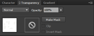 On the lower left you can see a thumbnail preview of the currently selected bubbles_grain group and right next to it the would-be-preview of the opacity mask if there was any. Click the Make Mask button to make one.
 - Click the now black opacity mask thumbnail to switch to the opacity mask editing mode. When the Clip checkbox is checked, the default background color of the mask is black, so everything in our group becomes invisible by default.
- Now copy the provided texture into the mask. All you should see are the anchor markings, but no changes to the transparency. In case the anchor markings are obstructing your view, hit Ctrl+H to hide them. Since our texture is just as black as the mask background, it’s obvious that it doesn’t have any effect. To fix this, uncheck the Clip checkbox to turn the background white (0% default opacity -> textured areas turn transparent) or invert the mask using the appropriate checkbox to turn the texture white (100% default opacity -> textured areas turn opaque). It’s a good idea to try out both and pick whatever looks better. At this point you should see the first results:
- Continue pasting more copies of the texture to cover up all the bubbles and make sure there are no visible seams. Hint: rotate the textures and use the reflect tool to horizontally or vertically mirror adjacent samples. Or, in case you just want to get done with this guide, grab the example solution.
 At this point you might be getting impatient and ask yourself “OK, looking good. Can I export it, yet?”, fire up AI2ASS and hit the export button only to find out that something’s wrong. Depending on the operation mode you picked, you might be looking at a either locked up AI window with AI2ASS trying to export the tens of thousands of paths you just pasted or at an output no different than what we had before all this texturing business. Turns out AI2ASS isn’t the kind of magic sauce I was selling it for (feel free to blame torque), so let’s take a break to look at its limitations.

AI2ASS Limitations
AI2ASS does export:
- Paths and compound paths, irrespective of any grouping.
AI2ASS does not export:
- Type: needs to be expanded to paths (use the Expand tool).
- Stroke: needs to be expanded if you want the result to look like it does in AI (use the Expand Appearance Tool). If a stroke is still present on object, AI2ASS will make a separate line for the object using the
\3cand\bordoverride tags. - Brushes and Effects: expand them to paths using the Expand Appearance tool.
- Envelopes (used for Warp and Mesh distortions): use the Expand tool.
- Gradients: must be expanded to a specified number of objects using the Expand tool. Additional processing is necessary and will be the subject of another blog post.
- Clipping Masks: use this AI script to permanently apply clipping masks.
- Raster image data: if you were seriously planning on exporting raster image data you may want to reconsider your occupation as a typesetter or learn how to live your life correctly.
- Transparency masks: use the Flatten Transparency tool.
Applying Transparency Masks
Now that we know which tool to use to convert our textured bubbles into pure vectors, let’s finish this up:
- Go back into regular editing mode, select the texture layer and Click on Object > Flatten Transparency…
- The only relevant setting on the Flatten Transparency dialog is the Raster/Vector Balance and we need it to be at 100% (all vectors). Click OK to run the tool.
- The tool will have successfully expanded our textured bubbles into texture confined to the bubble area. There’s a side effect, however. Areas that were supposed to be transparent are now separate vectors in pure white color. Thankfully those are easy to get rid of. Double click on the Magic Wand tool to open its settings panel. Set the tolerance to 0, because we don’t want it to accidentally select our light gray grain. At this point, your screen should look like this:
 If the fill color picker in the top toolbar shows a question mark instead of pure white, you are doing it wrong.
 - Hit the delete button to remove the unwanted vectors. Your bubbles should now be back to the way they looked before flattening the transparency mask.
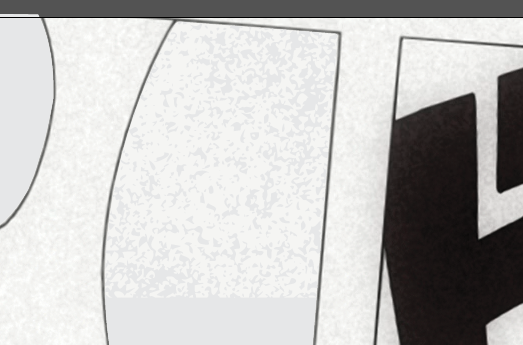
- Now before exporting this we want to check if we can reduce the grain complexity a bit without making it look too bad. Select the grain layer, hide the edges (Ctrl+H) and open the Simplify tool found in the Object > Path menu.
- Set the curve precision to 100% and check the Preview checkbox.
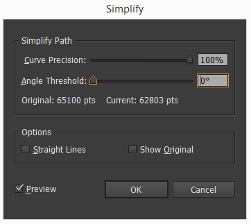 Wow, that’s a lot of vectors. In fact, it’s enough to already hear the leechers whining and almost twice as much as is required to make libass refuse to render it or even crash in not-so-recent versions. https://github.com/libass/libass/issues/115
 - Now reduce the curve precision stepwise and watch how the texture changes. Once you hit a point at which you can no longer accept any further simplification hit OK. You can also try tweaking the Angle Threshold, which tries to keep sharper edges at higher settings. For me that point was at 92% and 31815 Points - looks like libass users got lucky today.
- Finally it’s time to export our grainy mask! Fire up AI2ASS, hit Export and go grab a beer. Not because you deserved it but because AI’s JavaScript engine is really fucking slow and there’s nothing script authors can do about it.
- Copy the lines into Aegisub, add some blur, make some final color adjustments and pat yourself on the back.
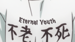
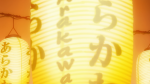
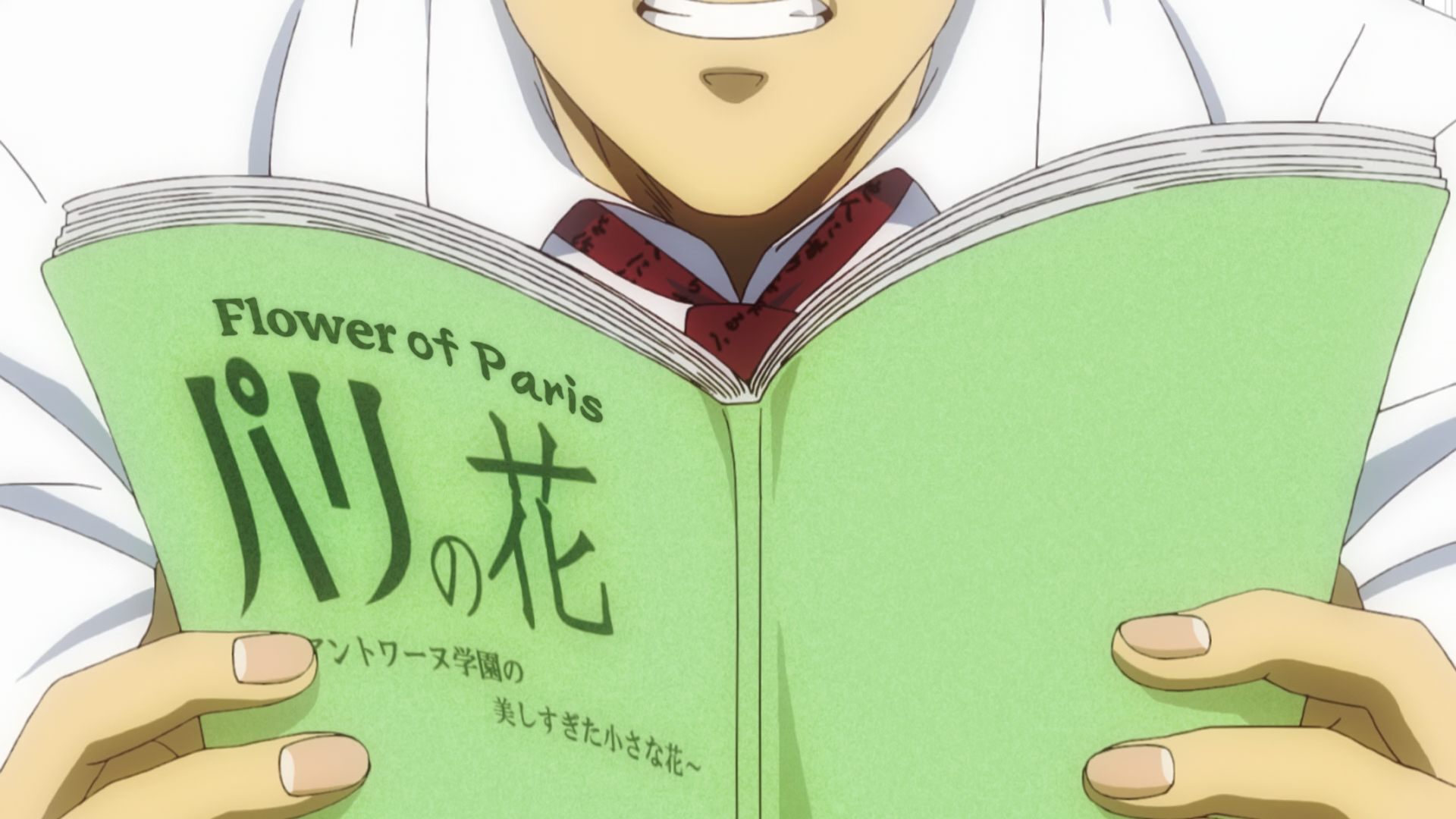
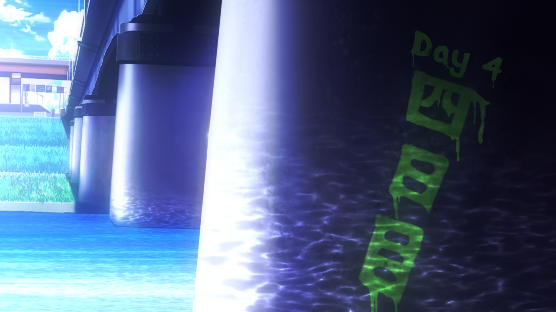
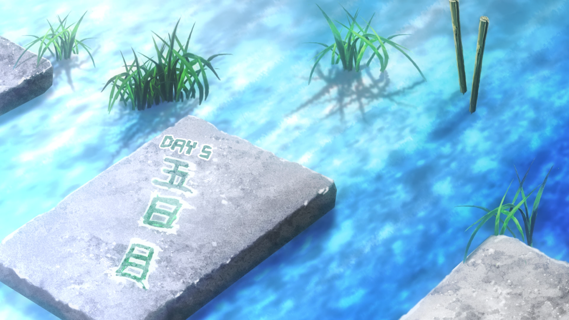
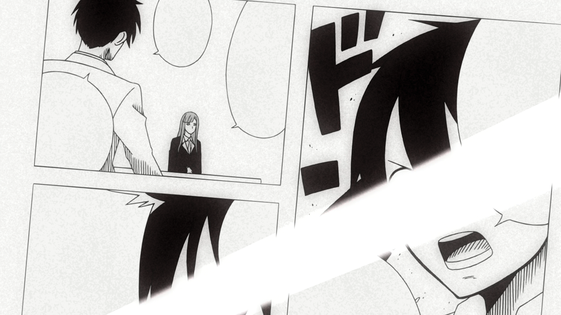
 That sure is some 2014 typesetting (unless you’d fuck up the rest). This sign appeared in Episode 6 of Arakawa Under the Bridge x Bridge and I traced and restored the Japanese so it could be shown alongside the English translation. As already mentioned, I had to scrap the grain layer of this sign for performance reason, but here’s a similar sign that still has it:


This would be a good point to wrap up this introductory guide on typesetting with Illustrator and AI2ASS, but unfortunately, there’s one more lesson to be had.
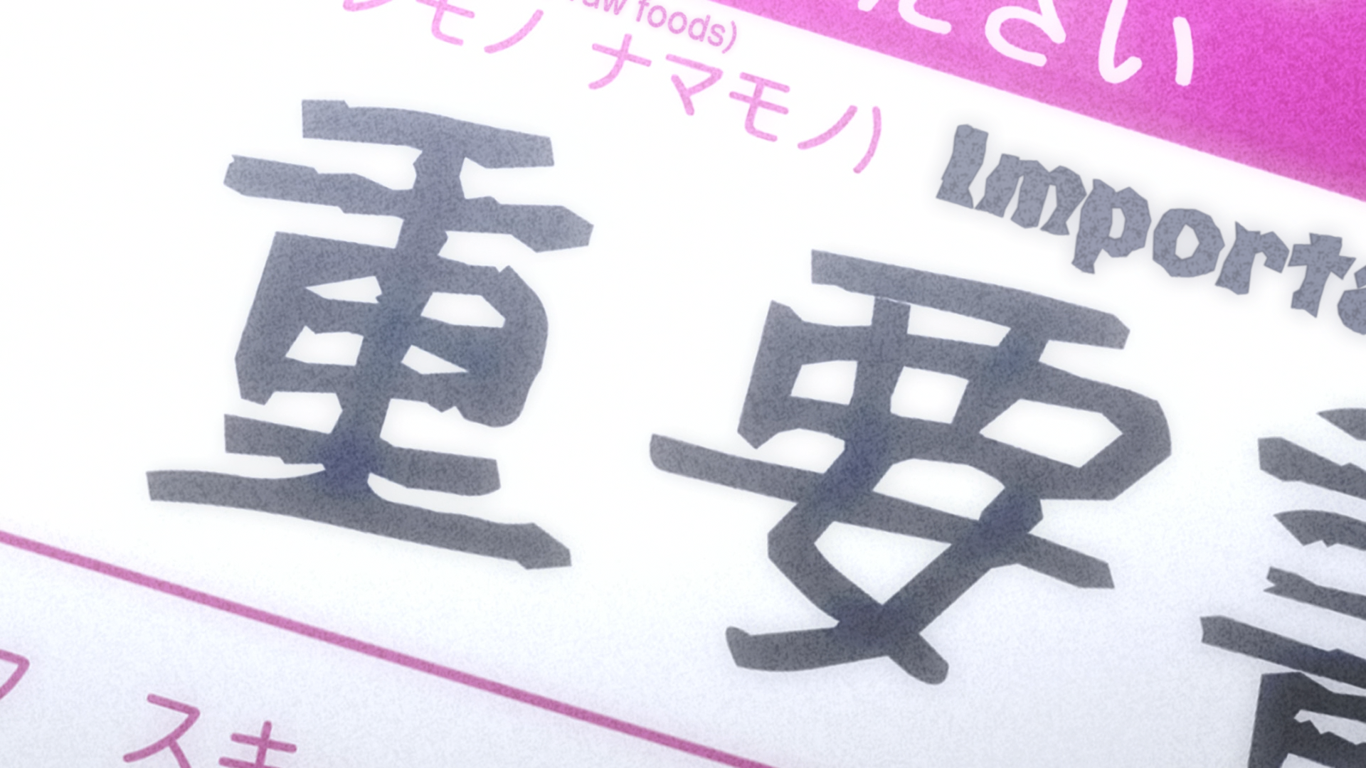
Example 3: Type and Stacking Layers
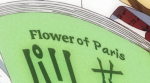
Our last Example deals with typesetting this scene and we’re going to work on this frame: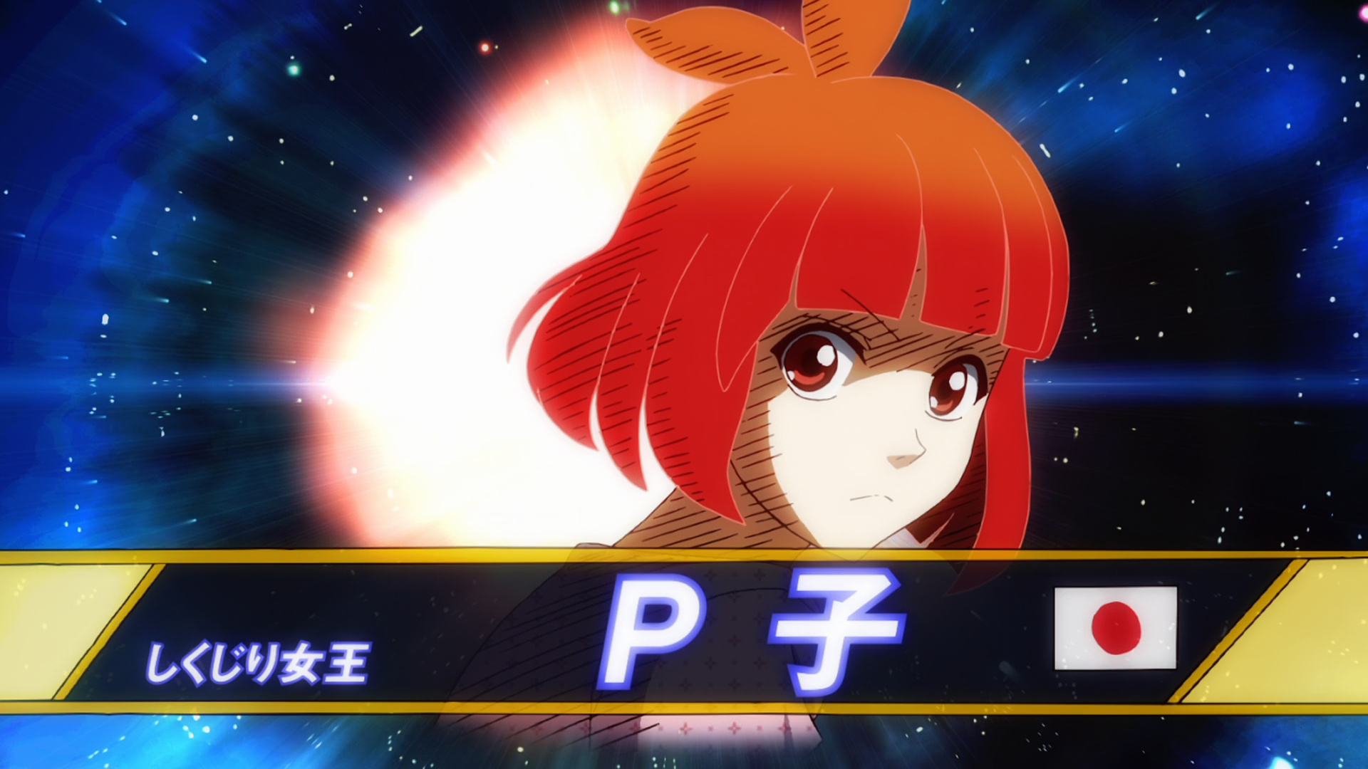 What’s so special about this text that we can’t do in Aegisub? We don’t want rounded borders, that’s all. So let’s dig out a nice gothic font and get started (I’m going to use Basic Gothic Pro).
- Create a new AI document, place the background image and create a new layer.
- Select the type tool and click next to P?
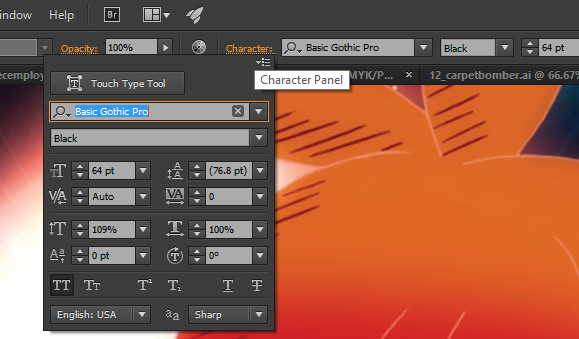
- On the top toolbar, set the font, weight and size. Then open the Character Panel and enable the ALL CAPS style.
 Type “P-ko” and make adjustments as you see fit. Don’t bother with the slant as it’s animated and we would have to
 \faxit later, anyway. Also, don’t add a stroke yet, because Strokes on type are always aligned to the center. A large stroke, as is required here, would “eat away” much of the fill and the whole thing would end up looking ugly: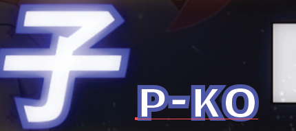
- Duplicate the layer because the operation is going to be destructive. Hide the “backup” layer.
- Now convert the type to shapes using the Expand tool found in the Object menu. Once you’ve gone vectors, there’s no going back to type.
- Make a copy of this layer and hide it (we’re going to need it in a moment).
- Add a stroke of about 5-6pt, set the Corners to Miter Join and align it to the outside of the shape
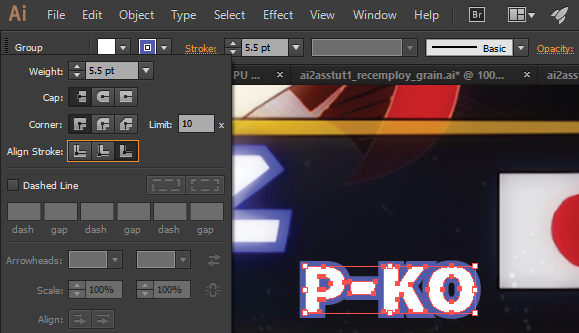
- Expand the appearance and take a minute to examine the result (ungroup and double click to enter Isolation Mode). Every of our stroked shapes is now actually made up of 2 paths/compound paths: one for the white fill and a cutout border.
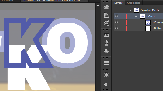 Every typesetter knows such an arrangement is bad news because as soon as we involve
 \blurthe background is going to shimmer through. In ASS we solve the problem by using the same fill and border color for the lower layer and making both fill and border opaque. And guess what - that’s exactly how we’re going to do it in Illustrator. - Select the whole sign and use the Unite Pathfinder. That’s it.
- Remember our copy from [6]? Enable it and move it to the top of the stack to get back the white fill.
- At this point we’re ready to export our sign to ASS. Check out the example solution to see if it matches your results.
Wrapping Up
If you made it this far and followed along with the examples you should be ready to do your own typesetting using Illustrator and AI2ASS and discover new ways to solve problems that are hard to tackle using Aegisub only. Please do comment if you have an item to add to the “Useful AI Tools and Applications for Typesetters” and don’t hesitate to ask if you have a problem (unless it’s a generic AI question that can be easily solved with a Google search). Also please point out errors of any kind and solutions better/faster/simpler than the ones presented here. I’m actually quite far from an Illustrator professional, so please take anything I wrote with a grain of salt. I’m also willing to take suggestions for upcoming blog posts. I already have an idea about the contents, but I’m pretty indifferent to the order I’ll write them in. Finally, here’s a little disclaimer in case the tone of this post has rubbed some dinosaurs the wrong way: I’m not advocating to entirely replace typesetting in Aegisub with doing it all in AI, because that would be silly, inefficient and would make scripts a lot less accessible for other typesetters fixing signs in the future (e.g. for BD releases). You can easily modify override tags, but changing drawing commands is simply not practical. Before I decide on whether to do a sign with AI I ask myself “Can I do the same thing with equally good results in a reasonable time frame (in less than twice the time it takes to do in AI) using only Aegisub?”. Thanks to unanimated’s and lyger’s automation scripts the answer is mostly “Yes!”. However, as the complexity of our typesetting increases, the odds are rapidly shifting towards software that offers both the features and, more importantly, fitting user interfaces to accommodate those needs. Take note that “higher complexity” only translates into “better signs” when in the hand of someone with both basic and advanced typesetting skills. tl;dr don’t start out with this guide when you’re new to typesetting (start here instead).